
Pre-Print Design Tips
- Dec 5, 2022
- 5 min read
Updated: Feb 4
Like all things, there are pros and cons of creating printed materials versus leaving them as digital media. However, with an understanding of the many possibilities print offers, you can create something that is as attractive and impactful as a digital piece, if not more.
One drawback of printed materials is that once they are produced, they are final. There is no option to make a little edit and quickly republish (without added time, costs, and headaches). Therefore, arguably the most important part of the print process is what happens before the printing begins.
So, here are four pre-print tips to make printing easier and to give you a better chance at making the most amazing, impactful, award-worthy printed material imaginable.
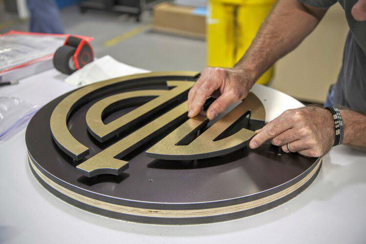
Consider the substrate on which you are printing.
Unlike digital materials, where your canvas is always a digital screen, print offers a plethora of substrates; the material on which you can build your masterpiece. With the advancement in print and material technologies, it’s astounding how many options are available.
So, what are some popular substrates available to you?
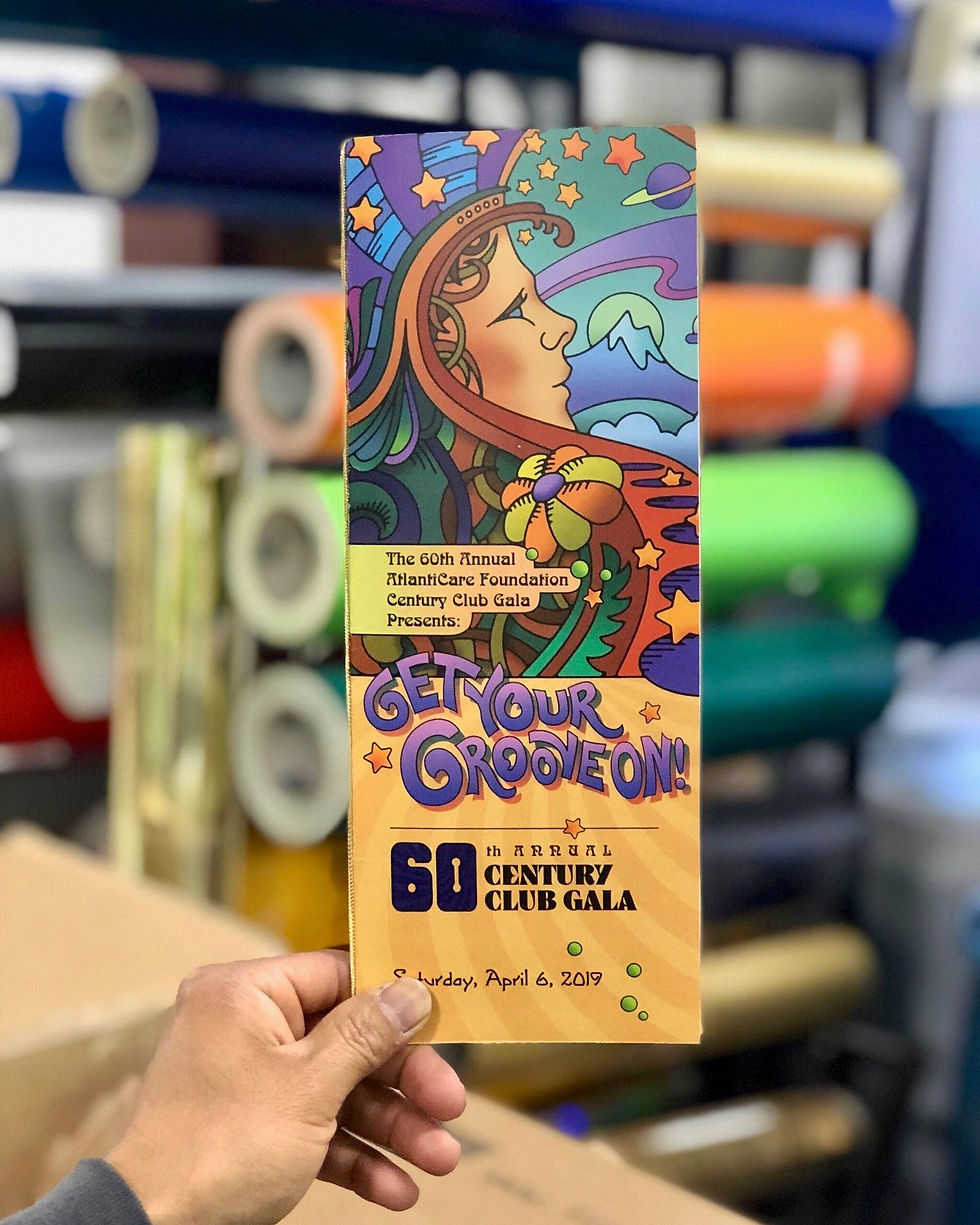
· Paper: This entire article could be dedicated to the various paper qualities that are available. But for a quick overview, there are several characteristics to choose from when deciding on paper: weight, coating, color, glossiness, and smoothness are just a few.
A heavier weight with a matte finish is common for what you see used for packaging. Lighter weights with a glossy finish and high smoothness is typically what you see for magazines or brochures.
· Metal: You may have thought of metal for etching and cutting, which are great options (and Omega can provide), but you can print on various metals as well. Metals like steel, aluminum, copper, and chrome, each offer unique color, shine, and hardness that can alter the way a print looks.
An eye-catching option to consider with metal is a mix of engraving and printing to add extra visual interest to the engraved area.
· Plastic: The term “plastic” encompasses a wide range of materials, including vinyl, polypropylene, polyester, acrylic, and more. A nice aspect of plastic substrates is that there is such a wide variety that offers unique looks and feels. Think about flexibility, opacity, color, and hardness.
· Wood: You know wood can be painted, etched, and carved. It can also be printed! Using special inks designed for wood printing, you can even create high-quality prints on wood that look like photos. It is important to consider the type of wood that is being used for the end application and to make sure the print is sealed properly. Otherwise, as the wood adjusts to temperatures and moisture, it expands or contracts and can alter the look of a print.
If you are working with a commercial printer, they should have substrate samples for you to see and touch. They should also be able to guide you to the substrate that makes the most sense for the look you are trying to achieve, as well as your budget.
Colors look different when printed.

There are several reasons that your printed materials can look different when compared to what you see on your screen. You should never rely on your screen for color matching when doing a print.
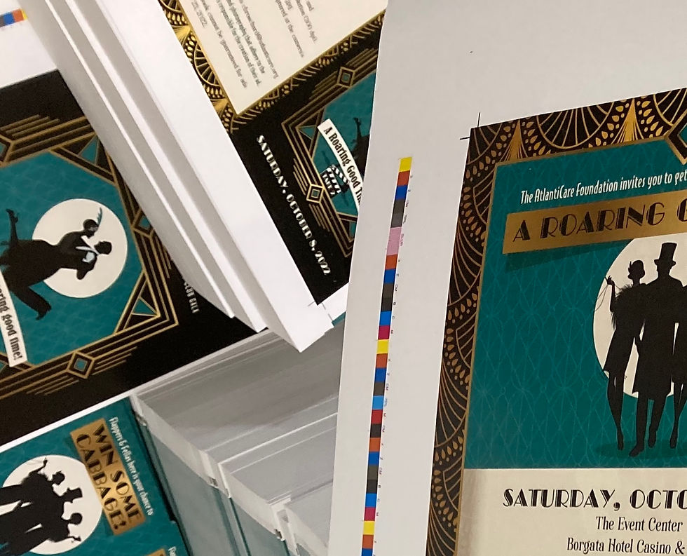
· RGB vs. CMYK: You may have heard of RGB and CMYK when referencing colors. RGB stands for Red-Green-Blue and CMYK stands for Cyan-Magenta-Yellow-Black. These refer to the color mixes that make the end color that you see. RGB is used for digital screens and CMYK is used for printing.
· Screen Brightness: Screen brightness is a variable that many people do not consider when viewing colors. But this variable has a significant effect on how color appears. A screen with the brightness set to a higher level may make colors appear much more vibrant and contrasting, which may not be achieved in a print.
· Substrate Color: The color of the substrate can alter the color of ink. Rarely will the ink have 100% opacity. So, some of the color from the substrate will show through and affect how the color of the ink appears.
· Ink Type: The type of ink that is used for the print can also affect the color. Some specialty inks can provide a metallic or glowing appearance, while some others can have the appearance of watercolor or oil. Depending on the type of ink used, it can change how a color looks.
Review every piece with a very critical eye.
One of the worst feelings when creating prints is getting the final piece and finding an error. As mentioned before, there is no quick edit and republish option for prints. So, always go through an approval process to review information, spelling, grammar, images, logos, color, etc.
If color and the substrate are key pieces of the material you printed, make sure to get physical samples approved before moving forward.
Provide print-ready design files to your printer.
This is a tip that will make the process move more smoothly when working with a commercial printer. There are several things you can do to ensure your design will print how you designed it after you hand the files over to your printer.
· Work and save the files in the correct color mode. Remember, RGB is used for digital and CMYK is used for print. When working in Photoshop, Illustrator, InDesign, Acrobat, and other Adobe programs, you have the option to select which color mode you are working in and which color mode to save the file.
· Make sure the size of your design is the final size of the piece. For example, if you want a 16” x 20” poster, create your design on a canvas size that is 16” x 20”. If the printer needs to adjust the size of the file, it could result in cropping and lower quality. Not to mention, additional costs.
· Always save your file at a high resolution. You may have heard of the acronyms DPI (Dots Per Inch) or PPI (Pixels Per Inch). DPI refers to the number of printed dots contained in one square inch of a printed image. PPI refers to the number of pixels contained in one square inch of a digital image. Many people in the industry use these terms interchangeably.
300 DPI is the recommended minimum resolution to use for print files. However, depending on the end use and size of the print, some printers may be able to produce an acceptable print with a 150 DPI file. Again, this is dependent on how important the quality of images and other elements are to your piece.
· Include crop marks and bleeds in the final file. This is especially important if you have a design with elements that go to the edge of the page. Crop marks are used for the printer to know where to cut the substrate. Bleed is the extra amount of space added around the edge to account for any cutting inaccuracies.
If you want graphic elements to “bleed” off the page, make sure the elements go to the bleed line.
· Use layers for printed pieces with lots of elements, multiple inks or finishes, or folding or cutting. This allows the printer to identify the elements that are being printed with each ink or finish, as well as what should be printed versus folded or cut. For example, if you are creating a piece with an element that will have a foil print and the rest will be printed with ink, the element that will be printed with foil should be on a separate layer from the rest.
Omega High-Impact Print Solutions has been providing expert print guidance and production for over 70 years, with experience printing a wide variety of inks, substrates, and finishes. Our team of in-house designers can assist in getting your files accurate for print and will work with you each step of the way. Contact us to find out what we can do for your next print project!
Written by Omega High-Impact Print Solutions’ Marketing Director, Jake Coburn.


Comments